
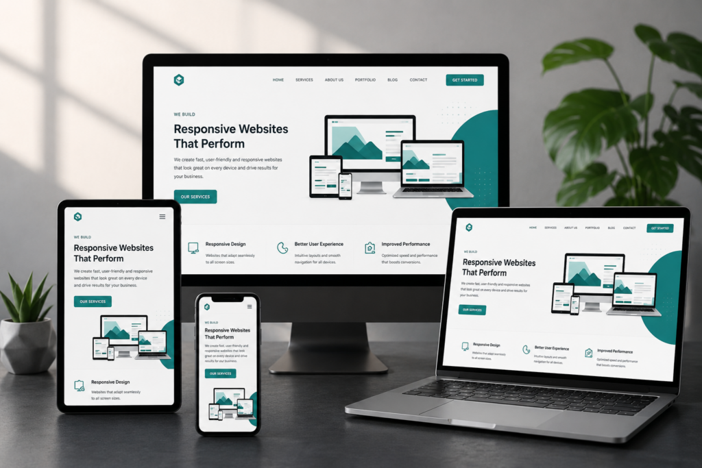
Why Responsive Website Design Matters More Than Ever
Your website is often the first interaction potential customers have with your business. Whether they discover you through Google, social media, or a referral, their first impression depends on how well your website performs across every device.
People browse on smartphones during their commute, compare services on tablets, and make purchasing decisions on desktops. If your website isn’t built to adapt to different screen sizes, you’re likely losing visitors before they even learn about your business.
At NXTR Solutions, we create responsive websites that provide fast loading speeds, intuitive navigation, and seamless experiences across mobile phones, tablets, laptops, and desktops. A responsive website isn’t just about appearance—it’s about delivering a better experience that builds trust and increases conversions.
What Is Responsive Website Design?
Responsive website design is an approach where a website automatically adjusts its layout, images, text, and functionality to fit the visitor’s screen size.
Instead of creating separate mobile and desktop websites, one responsive website intelligently adapts to every device.
This means users enjoy:
- Easy navigation
- Readable content
- Fast page loading
- Properly sized images
- Clickable buttons
- Consistent branding
No matter where your customers visit from, they receive the same high-quality experience.
Why Every Business Needs a Responsive Website
Better User Experience
Visitors expect websites to work perfectly on every device. If they have to zoom in, scroll sideways, or struggle to click buttons, they’ll likely leave within seconds.
A responsive design creates a smooth browsing experience that keeps visitors engaged.
Improved SEO Performance
Search engines prioritize websites that offer excellent mobile experiences. A responsive website helps improve crawlability, usability, and overall site performance.
Combined with optimized content and technical SEO, responsive design creates a stronger foundation for higher search rankings.
Higher Conversion Rates
Whether your goal is collecting enquiries, generating leads, or selling products, responsive websites remove friction from the customer journey.
Simple navigation and clear calls-to-action encourage more users to complete desired actions.
Faster Loading Speeds
Website speed directly impacts user satisfaction.
Responsive websites are optimized to deliver images, layouts, and resources efficiently across different devices, helping reduce loading times and bounce rates.
Essential Features of Responsive Website Design
A professional responsive website should include:
Flexible Layouts
Content automatically adjusts to fit every screen without breaking the design.
Mobile-Friendly Navigation
Menus remain simple and easy to access on smartphones and tablets.
Optimized Images
Images scale correctly without slowing down the website.
Readable Typography
Fonts remain clear and comfortable regardless of screen size.
Touch-Friendly Buttons
Interactive elements are large enough for mobile users.
Fast Performance
Optimized code, caching, and compressed assets improve speed.
Responsive Design vs Mobile Website
Many businesses still confuse responsive websites with separate mobile websites.
| Responsive Website | Separate Mobile Website |
|---|---|
| One website for every device | Separate mobile version |
| Easier maintenance | Double maintenance |
| Better SEO | Can create duplicate content |
| Consistent branding | Often inconsistent |
| Lower long-term costs | Higher maintenance costs |
Responsive design has become the preferred solution because it simplifies management while delivering a consistent experience.
Common Responsive Website Mistakes
Many businesses unknowingly reduce their website’s effectiveness by making these mistakes:
- Tiny text on mobile devices
- Slow-loading images
- Complicated navigation
- Pop-ups covering the entire screen
- Poor button spacing
- Unresponsive contact forms
- Broken layouts on tablets
Avoiding these issues significantly improves user satisfaction.
Industries That Benefit Most from Responsive Design
Responsive websites are essential for almost every industry, including:
- Corporate Businesses
- Startups
- Healthcare
- Restaurants
- Real Estate
- Educational Institutions
- Law Firms
- Financial Services
- E-commerce Stores
- Professional Service Providers
Every customer expects a smooth digital experience regardless of the device they use.
How NXTR Solutions Builds Responsive Websites
At NXTR Solutions, responsive design is included in every website we create.
Our process includes:
- Business discovery and planning
- User experience (UX) strategy
- Modern UI design
- Mobile-first development
- Performance optimization
- Cross-browser testing
- Responsive quality assurance
- Ongoing website support and maintenance
We build websites that not only look impressive but also help businesses generate enquiries, build credibility, and support long-term growth.
The Future of Responsive Web Design
Technology continues to evolve rapidly.
Today’s responsive websites are incorporating:
- AI-powered personalization
- Voice search optimization
- Progressive Web Apps (PWAs)
- Faster Core Web Vitals
- Interactive animations
- Accessibility improvements
- Smarter content delivery
Businesses investing in responsive design today are better prepared for tomorrow’s digital landscape.
Final Thoughts
A responsive website is no longer optional—it’s an essential part of building a successful online presence.
From improving user experience and SEO to increasing conversions and strengthening your brand, responsive design delivers measurable business value.
Whether you’re launching a new business, redesigning an outdated website, or expanding your digital presence, investing in responsive web design is one of the smartest decisions you can make.
At NXTR Solutions, we design and develop responsive websites that combine modern aesthetics, technical performance, and business-focused functionality to help companies succeed online.
Frequently Asked Questions
What is responsive website design?
Responsive website design allows a website to automatically adapt to different screen sizes and devices while maintaining usability and visual consistency.
Why is responsive design important?
It improves user experience, supports SEO, increases engagement, and helps convert more visitors into customers.
Does responsive design improve Google rankings?
While it’s not the only ranking factor, mobile-friendly responsive websites generally perform better in search results because they offer a better user experience.
How long does it take to build a responsive website?
The timeline depends on the number of pages, required features, and project complexity.
Can an existing website be made responsive?
Yes. Most websites can be redesigned or rebuilt with responsive functionality without changing the business identity.
Does responsive design increase website speed?
When developed correctly, responsive websites load faster through optimized images, efficient coding, and modern performance techniques.
Is responsive design suitable for eCommerce websites?
Absolutely. Responsive online stores provide better shopping experiences and improve mobile conversion rates.
Why choose NXTR Solutions?
NXTR Solutions develops responsive websites that combine modern design, robust development, mobile optimization, and scalable technology to support long-term business growth.