
The way people browse the internet has changed dramatically over the past few years. Today, most users search for products, services, and businesses directly from their smartphones. Whether someone is looking for a restaurant, a software company, or a local service provider, their first interaction with your business is often through a mobile device.
If your website isn’t designed to work seamlessly on smartphones and tablets, you’re likely losing potential customers every day.
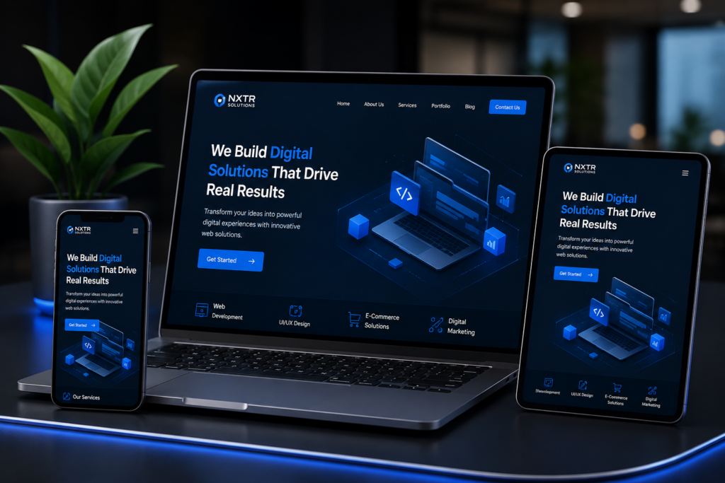
At NXTR Solutions, we help businesses build responsive, high-performance websites that deliver exceptional user experiences across every device. A mobile-friendly website is no longer an option—it’s a necessity for business growth.
What Is a Mobile-Friendly Website?
A mobile-friendly website automatically adjusts its layout, images, buttons, and content to fit different screen sizes. Visitors don’t need to zoom in, scroll sideways, or struggle to navigate your pages.
A responsive website provides a smooth browsing experience whether users access it from:
- Smartphones
- Tablets
- Laptops
- Desktop computers
This flexibility ensures every visitor enjoys the same professional experience regardless of the device they use.
Mobile Users Now Dominate the Internet
More than half of global web traffic now comes from mobile devices. Customers compare products, book appointments, make purchases, and contact businesses while they’re on the move.
If your website is difficult to use on a phone, visitors will quickly leave and choose a competitor with a better mobile experience.
Businesses that invest in responsive web design stay ahead by meeting customer expectations from the very first click.
Better User Experience Builds Trust
First impressions happen within seconds.
When visitors land on your website, they immediately judge your business based on its appearance and usability.
A mobile-friendly website offers:
- Easy navigation
- Fast-loading pages
- Readable text
- Properly sized images
- Clickable buttons
- Smooth browsing experience
These features create trust and encourage users to stay longer, explore your services, and contact your business.
Mobile-Friendly Websites Improve SEO Rankings
Google prioritizes mobile-friendly websites when displaying search results.
If your website isn’t optimized for mobile devices, it may struggle to rank competitively, regardless of how good your content is.
Responsive websites help improve:
- Search engine visibility
- Organic traffic
- Page experience
- User engagement
- Crawlability
A properly optimized website gives your business a stronger online presence and increases the chances of attracting qualified visitors.
Faster Websites Generate More Leads
Website speed has a direct impact on customer behaviour.
Research consistently shows that visitors abandon websites that take too long to load.
A responsive website built with clean code, optimized images, and efficient performance keeps visitors engaged and reduces bounce rates.
At NXTR Solutions, performance optimization is integrated into every website we develop, ensuring businesses benefit from faster loading times and better conversion rates.
Increased Conversion Rates
A visitor may be interested in your services, but if your contact form is difficult to complete on a mobile phone, they may never become a customer.
Responsive websites simplify the entire customer journey.
Visitors can easily:
- Request quotations
- Fill out enquiry forms
- Book appointments
- Purchase products
- Contact your business
The easier the process, the higher your conversion rate.
Strengthen Your Brand Image
Your website represents your business 24 hours a day.
An outdated or poorly optimized mobile website creates the impression that your business is behind the times.
A modern, responsive website demonstrates professionalism, reliability, and attention to detail.
Customers naturally place greater trust in businesses that offer polished digital experiences.
Support Every Stage of the Customer Journey
Today’s customers often begin researching on their phones before switching to another device to complete a purchase.
A responsive website maintains consistency across every platform, allowing users to continue their journey without frustration.
This seamless experience helps businesses generate more enquiries and sales.
Why Businesses Choose NXTR Solutions
At NXTR Solutions, we don’t simply build attractive websites—we create digital platforms that help businesses grow.
Our website design and development services include:
- Responsive website design
- Custom website development
- WordPress development
- Shopify development
- Laravel development
- React & Next.js solutions
- Website redesign
- Website maintenance
- Performance optimization
- SEO-ready development
Every project is designed with speed, usability, scalability, and business growth in mind.
Future-Proof Your Business
Technology continues to evolve, and customer expectations continue to rise.
Businesses that invest in responsive websites today are better prepared for tomorrow’s devices, browsers, and digital trends.
A mobile-friendly website protects your investment while providing customers with the experience they expect.
Final Thoughts
Your website is often the first conversation customers have with your business. If that experience is slow, difficult, or poorly optimized for mobile devices, you risk losing valuable opportunities.
A responsive website improves user experience, strengthens your search engine rankings, builds trust, and increases conversions—all while supporting long-term business growth.
If you’re ready to upgrade your online presence with a fast, responsive, and professionally designed website, NXTR Solutions is here to help. Our team creates custom digital experiences that work flawlessly across every device and help businesses achieve measurable results.